Tuesday, 22 November 2011

Final Work.


Collection of products/ branding include: Promotional posters; t-shirts; t-shirt packaging; business card; letter head.

The repeat pattern on acetate is supposed to mimic a cellophane wrapper for the t-shirt.  Seeing as I couldn't print onto the cellophane due to it being too malleable and shiny I thought this was the next best thing that would visually replicate it.

 Sticker for the bag that stays stuck once ripped open at the top, serving as a decoration once its function has been fulfilled.  Printed black ink on heavy gsm black stock, I then foiled the black in with glossy white foil to give a spot varnish effect.  The bright orange ribbon is supposed to inject a hint of colour against the stark monochrome branding, whilst also hinting at the colourful print within.


I have screenprinted my design onto a t-shirt using two colours- red and black.  Overall I think it works well,  however the only reason this colour scheme has been adopted is because unfortunately, prior to me printing,  my screen was not exposed properly, leaving many gaps in my designs.  This is how I have overcome it.


The tag at the bottom of the tee adds a sense of quality whilst reinforcing the brands identity.
Below is the proposed stock I initially wanted to print onto, but had to change once I realised it was impossible with the available facilities to me.


Not the best photo, but very hard to take an image that would depict what this is.  The lining of the bag.  Here I have printed onto acetate and stuck it on the inside of the bag.  I wanted to achieve a black ink on black stock finish, but unfortunately with stock this size it is not possible with the available facilities. 


Monday, 21 November 2011

Never say you are the 'best'.

How do I need to communicate and how does it match to what my clients/employers need?

First of all, a creative C.V would help.

A few more tips from David Airey

CV tips for graphic designers

99% of CVs are poorly designed. It’s a struggle.
If your CV is good, and relevant to me, you have a higher chance of getting a response.
The creative director often isn’t the person to contact. Many times senior designers are the first port of call for interviews. There is no harm in sending a CV to more than one person at an agency.
Be creative, but don’t be pushy. Agencies find it very difficult to enlist good staff. That’s why most use expensive recruitment agencies.
Here’s my advice to graphic designers trying to get their CV to the top of the pile:
  1. Brand yourself. Make yourself memorable. I know that some people may disagree with this, which seems to be a USA thing, but your CV is seen by a creative, not the accountants. ‘Wow’ them.
  2. Be more than a sheet of paper. Most CVs are now sent by email. What can you do to differentiate yourself?
  3. Don’t include things I don’t care about, like ’I once worked as a waiter’ or ’I got a qualification in chemistry’. I don’t care if you like swimming. I do care, however, if you saw the last lecture by Paul Rand before he died and what your thoughts were. Make it relevant.
  4. Ensure everything is beautifully presented. Consider your kerning and double-check there are no silly mistakes — we all want to employ a safe pair of hands.
  5. Follow-up anything you send with a phone call, but remember, don’t hassle, be polite. Ask them what they thought of your CV and how it could be improved.
  6. Don’t try too hard. One student sent a mailer that was a fake bomb (with the tag line ’dynamite designer’. The bomb squad were called and the designer was contacted — by the police. He didn’t get the job. This raises another point — don’t boast, no-one wants to employ an arrogant designer. Never say you are the best. Leave that to Mohammed Ali.
Patience + time = job. Good luck.

I think one of the most important things to remember is that I am in a creative profession- If i'm sending my C.V to a possible employer I want them to like what they see from the get go.  Make it memorable.


Friday, 18 November 2011

Print for Production, Progress Crit.

After todays session it came to my attention that I need to get on with producing things.  


"The content/ concept is good but no evidence of the brand/ product in the real world.


"Experiment with different stocks.  Don't just use one type all the time"


One of the strengths that were highlighted from the crit was the extensiveness of my research, and that the branding has clearly been informed by the subject matter.


Action plan:


I need to try creating my bag for the tees in different stocks.
Go out in Leeds and take some images!  This should have been done long before now.


These need to be done ASAP.  And will be.

Tuesday, 15 November 2011

Enterprise Group.

Once we had our final Enterprise seminar I had already thought about who i'd ideally like to work with.  I sent an email out to Joe Warburton; Luke O'Brien and Max Gregory.  My thought process initially was that they are good at what they do and i've never worked with them before.  I then started thinking about the argument I would put across to try and persuade them that we should all be in a group together.  I was hoping that they would note my organisation of taking the initiative to send the email and see it as a good thing.

Here are the replies:

 
I also got verbal confirmation from Joe.

We have yet to set a date for our first meeting.

Friday, 11 November 2011

Note to Self

Note to Self:


BECOME BEST FRIENDS WITH A PRINTER.  Preferably a good one.

Wednesday, 9 November 2011

Print for Production, Progress Crit

We were asked to critique our groups work in pairs.  We thoroughly analysed all of the persons work from this whole brief to answer in-depth questions on what it is they are doing and how well this work answers the brief.
Below is my own feedback:


So, from this I have devised an action plan of my own:


Tuesday, 8 November 2011

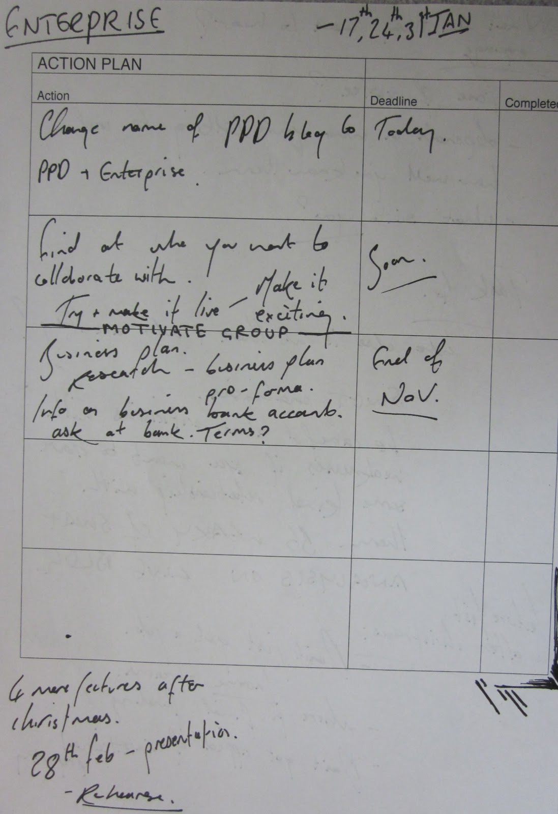
Enterprise Tutorial

The main aims of the tutorial were to highlight what we need to complete; lectures to come, and deadlines set.