Showing posts with label OUGD201. Show all posts

Wednesday, 9 May 2012

Workroom / / Korea


client
the national theater company of korea

design
kim hyung-jin

2012. 3
postcard
150 x 210 mm


I think this is definitely where I want to end up in my life.
My plan is to get into contact with them to gain further 
understanding of the use of the grid systems within Korea
and international type and layout communication.


Very good primary research for my dissertation and also
very interesting to me.  Can't wait to get in touch and see
what they have to say - some very considered and 
intelligent approaches to design.


Where I aspire to be.


It seems that rather than following trends, (something i've 
found a lot whilst researching) they really do work as visual 
communicators to try and find the most appropriate solution 
to the problem, whilst making the work look appealing & 
digestible.

Tuesday, 22 November 2011

Module Evaluation


Final Work.


Collection of products/ branding include: Promotional posters; t-shirts; t-shirt packaging; business card; letter head.

The repeat pattern on acetate is supposed to mimic a cellophane wrapper for the t-shirt.  Seeing as I couldn't print onto the cellophane due to it being too malleable and shiny I thought this was the next best thing that would visually replicate it.

 Sticker for the bag that stays stuck once ripped open at the top, serving as a decoration once its function has been fulfilled.  Printed black ink on heavy gsm black stock, I then foiled the black in with glossy white foil to give a spot varnish effect.  The bright orange ribbon is supposed to inject a hint of colour against the stark monochrome branding, whilst also hinting at the colourful print within.


I have screenprinted my design onto a t-shirt using two colours- red and black.  Overall I think it works well,  however the only reason this colour scheme has been adopted is because unfortunately, prior to me printing,  my screen was not exposed properly, leaving many gaps in my designs.  This is how I have overcome it.


The tag at the bottom of the tee adds a sense of quality whilst reinforcing the brands identity.
Below is the proposed stock I initially wanted to print onto, but had to change once I realised it was impossible with the available facilities to me.


Not the best photo, but very hard to take an image that would depict what this is.  The lining of the bag.  Here I have printed onto acetate and stuck it on the inside of the bag.  I wanted to achieve a black ink on black stock finish, but unfortunately with stock this size it is not possible with the available facilities. 


Friday, 18 November 2011

Print for Production, Progress Crit.

After todays session it came to my attention that I need to get on with producing things.  


"The content/ concept is good but no evidence of the brand/ product in the real world.


"Experiment with different stocks.  Don't just use one type all the time"


One of the strengths that were highlighted from the crit was the extensiveness of my research, and that the branding has clearly been informed by the subject matter.


Action plan:


I need to try creating my bag for the tees in different stocks.
Go out in Leeds and take some images!  This should have been done long before now.


These need to be done ASAP.  And will be.

Wednesday, 9 November 2011

Print for Production, Progress Crit

We were asked to critique our groups work in pairs.  We thoroughly analysed all of the persons work from this whole brief to answer in-depth questions on what it is they are doing and how well this work answers the brief.
Below is my own feedback:


So, from this I have devised an action plan of my own:


Monday, 24 October 2011

Production for print- Print considerations

Print considersations:

Five Print Formats:
1. Vinyl Prints; Wall designs for clothing environment.
2. Large posters/billboards.
3. Digital Print
4. Labels for clothing.
5. Bus stop posters?

Five Print Methods:

1. Rotary screenprint- merch for clothing company.
2. Digital print: large scale prints, promotion-  i.e. billboards
3. Screenprinting tees.
4. Spot varnish/foil blocking/flocking etc.
5. Lithoprinting

Five Print Considerations:
1. Colour restrictions- price wise.
2. Spot Varnish/ Foil blocking etc.
3. Stock/ material printing onto.
4. TIME.
5. Binding- look book.

Saturday, 22 October 2011

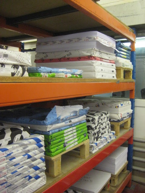
Print visit, DUFFIELD


DUFFIELD LEEDS.


 "No matter how I try to dress up my business, or fathom out how it works, I always come back to the same old logic, it's all about people and business relationships, which is why I only employ the best and most experienced work ethic driven people."


 Die Cutters.


Tuesday, 18 October 2011

'Wrap it up', Packaging Considerations.

'Wrap it up' Crit.


STRENGTHS:
- Use of stock.
- Use of colour.
- Pattern works well and reflects subject matter.

IMPROVEMENTS:
- Lack of consistency.
- Try something new with the packaging- reinvent it/ modify it.
- Try type.
- More information needed.
 

Good is... Rationale

Good is...

Persuading a young adult audience to get interested in Aztec history through the medium of clothing.

Why?
- Broadens knowledge of another culture.
- The designs of the culture are visually interesting/stimulating.
- A fun way of educating, which also educates others as it is always on show.
- Transfers well into todays society.
- Meaning behind every image/design/pattern adds depth to any visual.

I intent to...
Promote my clothing brand through branding and inform/educate my audience about Aztec History.

...a group of
Young adults aged 18- 24 who are interested in patterned clothing.

In order to achieve this I will produce...

Product-
An exceptionally well branded clothing company which design T-shirts focusing on Aztec imagery and the meaning behind that imagery.
Range-
A branded identity for the clothing company, i.e, logo, letterheads, business card etc.  T-shirts with printed designs.  
Context-
The product and promotion will be seen in high end high street stores, and on the web.