What skills have you developed through this module and how effectively do you think you have applied them?
Before I began this course I had no clue how to use Illustrator, now I feel I can experiment enough to teach myself what I want to achieve- to a reasonable standard.
My time management skills have increased from what they used to be. My productivity is more successful because I have a lot more to do in a lot less time- so it has to be. However I still have room for improvement within this area. I have improved my organisational skills by refering to my diary every day so i know what's going on and I know what to bring. I also refer to 'Moodle' daily to keep up to date with deadlines.
I have mainly learned that 'less is more'. It's difficult to keep it simple, but I think that it is necessary sometimes and I am slowly learning this.
What approaches to/ methods of research have you developed and how have they informed your design development process?
I've realised that primary research is key. For example if in the 'How to...' brief our target audience was students in our college that do Graphic Design that could go for naps during the day. We asked people on our course for constant feedback of what they thought, and I think that in the end, the final resolution worked, mainly, because of this.
I have also developed researching throughout a whole brief and not just at the beginning. Doing this keeps the development informed and overall more successful. You can't just do it at the beginning- it's got to be a constant to keep it interesting.
What strengths can you identify in your work and how have/ will you capitalise on these?
I found that my strengths are my concepts. I justify everything I do in relation to the concept I am following so therefore it usually makes sense. I plan on capitalising this by continuing to inject my ideas into everything I do to keep consistency and depth.
What weaknesses can you identify in your work and how will you address these more fully?
I tend to forget about the specifics within a brief. I get carried away with the concept I have come up with and forget about certain aspects within the brief. If I think my idea is good then I tend to carry on with it because It works, but doesn't necessarily answer the brief. I am also constantly generally unsure about the quality of my work and what decisions to make. I need to gain confidence in my abilities.
Identify five things that you will do differently next time and what do you expect to gain from doing these?
-Refer to the brief a lot more. My final resolutions will answer the brief and be more informed.
-Add more to my context blog. I need to research more thoroughy what is going on in the world regarding designers work.
-More development work. My final designs will be successful in communicating a message (something they have been lacking) because of trying and testing. Learning from mistakes.
-Blog each day rather than in one bulk. I'll remember everything i've learned by going over it on the same day.
-Create more physical prototypes, rather than doing a sketch and deciding something doesn't work. Perhaps my ideas could grow into something more successful and interesting because i've developed them further.
Monday, 22 November 2010

Saturday, 20 November 2010


Friday, 12 November 2010
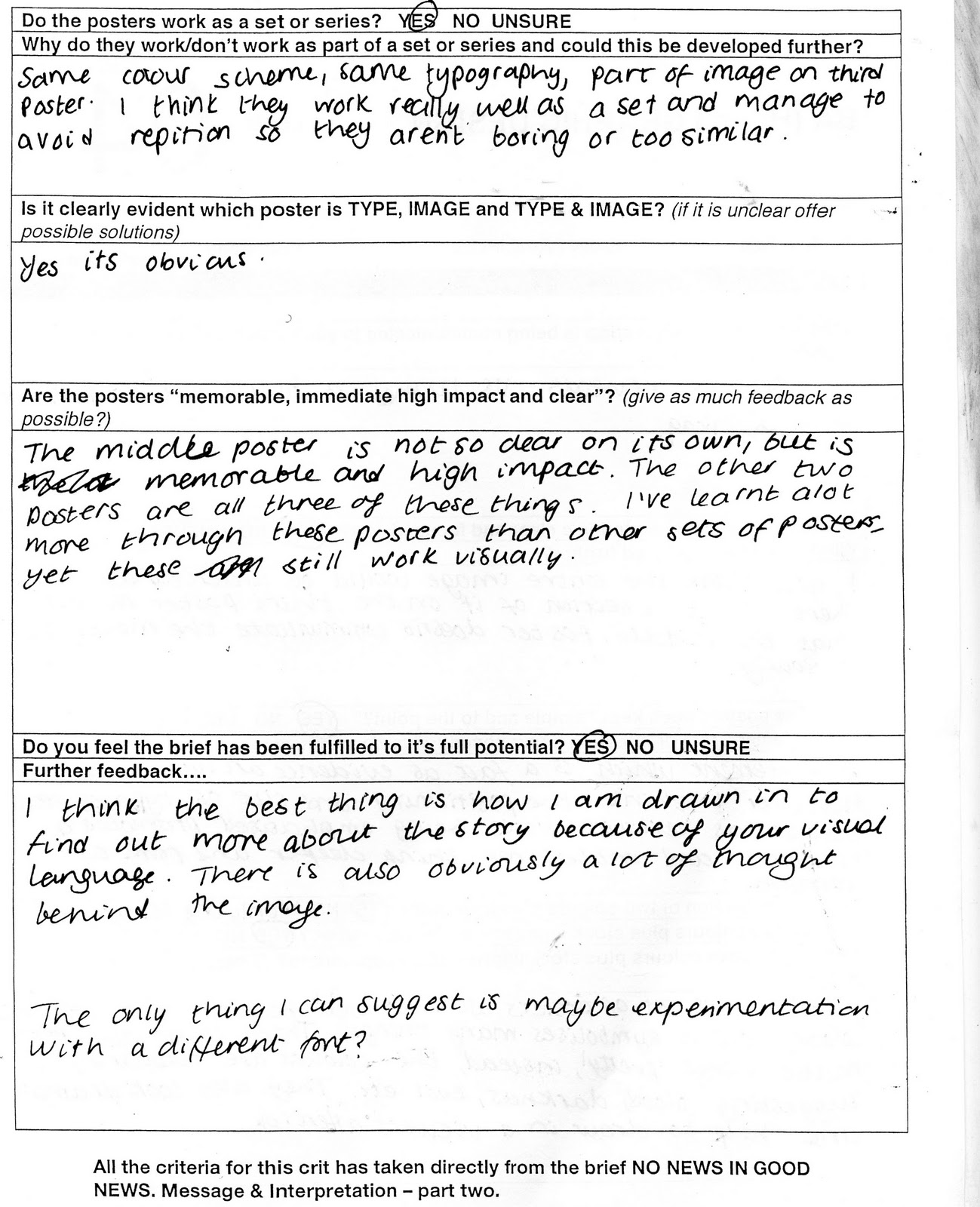
No News is Good News, Message and Delivery, Mailshot- Progress Crit.
Issues Raised:
No poster. For sure. -takes away from the whole concept of opening a new envelope and revealing new information.
Layout of type. -try working with different areas within the frame.
Action to be taken:
-have a final piece of card so you cant open it- finalising the point and also emphasising it. i.e. use the fact 'Wikileaks reveals U.S turned a blind eye to torture'- that's the last thing they find out, there is nothing left after this.
-mess around with type layout and perhaps colour scheme.
Thursday, 11 November 2010
No News is Good News- Evaluation and Final Pieces
Below is my final resolution for this brief. Because of the print quality of these posters the black has come out much more solidly, and what was previously red has become the colour I wanted- a more orange hue of red. Giving it a more morbid feel, that connotes the grime of war. I think this colour scheme is successful against the popular 'blood red' and black, as it still gives a feeling of darkness, yet the viewer is seeing something new.


Above are my resolutions being evaluated below. I think the crit was correct in saying that it is unclear at times what you are reading. This is unfortunate as I am unhappy with the quality of the printout- the colours are not what I want at all. If the black was darker then the other colour would stand out much more, and probably rectify the issue. Above this photographed image is my digital version before print which represents what I had initially designed.


Monday, 18 October 2010
Alphabet Soup Part 2- Final Typeface

Once I completed this brief i decided to create a lower case version to see if it would work. Above is my final resolution of that version.

Above is the evaluation of my typeface created for Sarah Pritchard.


This is my evaluation on Sarahs' typeface for me.
Below is the action I am going to take from the crit we had halfway through the brief.

Tuesday, 12 October 2010
Alphabet Soup- Part two.
Mid Crit:

Rationale:
Brief:
I need to create a font that visually communicates the personality of the partner i have been put with. I also need to create a name badge for her also.
Who needs to know?
My audience is my partner and my peers.
What do they need to know?
The personality of my partner through this font.
Why do they need to know?
So they understand the reasons for all my choices to do with the font.
What will they respond to?
Aspects of their personality put across in an original way.
What research is required?
Primary and secondary research. Below.
Primary research:
Who are you?
Sarah Pritchard.
Where are you from?
Barnsley
what is your earliest memory?
Going to Disneyland when I was 9.
Cat or dog?
Dog
Where would you like to live?
New York
What would your superpower be?
-
If you could bring something extinct back to life what would you choose?
-
What is your most unappealing habit?
Fidgeting
What is your favourite word?
Awesome/mint
What is your favourite book?
-
Who would you invite to your dream dinner party?
Blink 182
If you could edit your past what would you change?
Nothing
If you could go back in time where would you go?
To year 9 to re-do things.
What do you consider your greatest achievement?
Getting onto this course.
Tell us a joke.
-
Tell us a secret.
-
Further questions:
What is your favourite colour?
Blue, any kind.
Who is your favourite designer?
Neville Brody.
Serif or Sans serif?
Sans serif.
Detail or simple?
Simple and bold.
From this I have come up with five adjectives to describe Sarah Pritchard and to base my design around, these are:
FUN
BOLD
NOSTALGIC
HARD TO READ
EXCITABLE
Secondary research:
Sans serif shaded:
I thought that this type showed mainly her fun and bold side. With a hint of nostalgia from its overall childish look. I think i can incorporate the other adjectives into the font whilst experimenting with my design further. -this is a good starting point.
Tuesday, 5 October 2010


Monday, 27 September 2010
'How to... survive the day in college.' Final Piece- NAP MAP


The images above show the front, back and inner final design of our 'Nap Map'. The colours are simple; the format is simple and the overall design is simple. It needed to be this way because of the nature of 'napping'- if you are finding somewhere to take a nap you are likely to be tired and are therefore not going to take in alot of information- it is suitable to the audience we created it for.
'How To'.... Self evaluation


Rationale:
The Brief:
To solve the problem you have been given, ours was:
'How to...Survive the day in college' -defying tiredness.
We had to come up with an appropriate response to this brief in order to successfully complete it.
What do you need to communicate?
We need to clearly communicate to students within the college on how to defy tiredness in these first few weeks of College.
Why do they need to know?
They need to know 'How to survive the day in college' to make the beginning of their new lives as comfortable as possible in the foreign environment.
What will they respond to?
Because they are students and we are all students we feel that humour and a hand rendered approach will force them to respond to it. We think that an interactive piece will also make the students take in what they are looking at/holding.
Where do they go?
The resolution will be available in college because the problem mainly affects students in college.
We intend to create a map of the college and incorporate nap spots within specific areas. We will include different areas that show the level of tiredness so the student can nap accordingly. The student is are target audience.
The general aim is to make it look as organic and hand rendered as possible to give a personal touch that students will respond to. However we will experiment with different looks to see what works the best.
Subscribe to:
Posts (Atom)