We were asked to design a business card (of which i've
already done hundreds of different variations- of course),
along with a piece of promotional material that best
describes us as designers.
My aim is to create something that is ultimately
going to shock everyone. It needs to obviously
communicate me as a designer, however, this can
be clarified visually rather than me spelling it
out for the viewer.
So, the beginnings of:
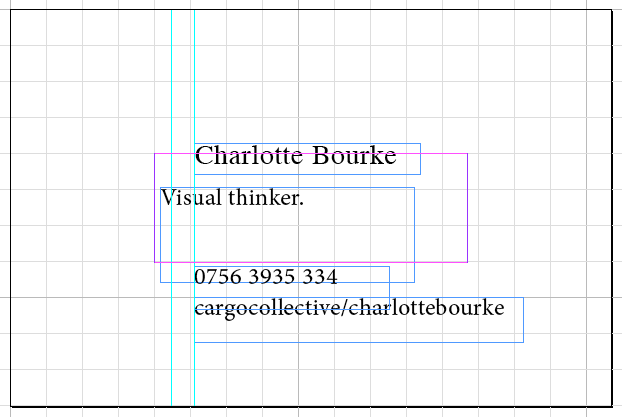
My first job was to try and identify exactly what
should be on my business card and promotional
item. As above, I justified my name being most
important within the visual heirarchy of both
because the design should say exactly what kind
of designer I am and solutions I produce.
My name and website are close within the heirarchy.
hhhh